
Introduction: Beyond Just Fitting – Intentionally Enlarging Images
When working with web development, developers often need to make images larger than their original size for various design purposes. Whether creating hero sections, product galleries, or responsive layouts, So you have increase image size in CSS understanding how to properly increase image dimensions is essential for modern responsive web design.
What Does “Increasing Image Size in CSS” Mean?
Increasing image size in CSS refers to the process of making an image appear larger on screen than its natural dimensions. This can involve scaling up regular images within their image container or enlarging background images to cover larger areas. The process differs significantly from simply uploading larger image files, as it works with existing assets to create the desired visual effect.
The Core Challenge: Balancing Size, Quality, and Performance
The primary challenge when enlarging images lies in maintaining image quality while ensuring optimal performance. When scaling images beyond their original size, pixelation can occur, especially with low-resolution sources. Additionally, larger images can impact loading times and user experience across different screen sizes.
Understanding the Fundamentals: CSS Scaling vs. Image File Resizing
CSS Scaling: Changing Display Dimensions (Not File Pixels)
CSS scaling modifies how images appear in the browser window without altering the actual image file. This method uses CSS properties to control display dimensions, making it ideal for responsive design scenarios where images need to adapt to various viewport sizes.
Image File Resizing: Altering the Pixel Settings of the Image File

Image file resizing involves modifying the actual pixel settings of the image file itself. This process creates new versions of images at different resolutions, which can be more suitable for certain scaling scenarios but requires additional file management.
When to Rely on CSS vs. Pre-Processing Your Images
CSS scaling works best when you need flexibility across multiple screen sizes or when implementing responsive images. Pre-processing images becomes necessary when you require consistent image quality at specific dimensions or when working with CMS systems that have strict requirements.
Core CSS Properties for Controlling and Enlarging Image Display
Using Width and Height Properties
The most straightforward approach to increase image size involves using the width property and height properties directly. These properties allow precise control over image dimensions:
img {
    width: 800px;
    height: 600px;
}
Max-Width and Max-Height: Preventing Excessive Scaling
To prevent images from becoming too large on bigger screens, max-width and max-height properties provide upper limits while maintaining the aspect ratio:
img {
    max-width: 100%;
    max-height: 500px;
}
The Power of Object-Fit for Images Within Containers
The object-fit property controls how replaced elements like images fit within their containers, offering similar functionality to background sizing for regular image elements.
Increasing Background Images with Background-Size
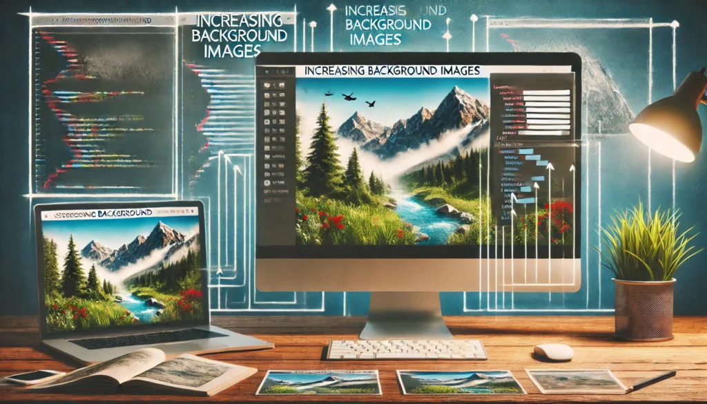
Understanding the Background-Image Property
The background-image property allows images to be set as backgrounds for elements, providing more flexibility in sizing and positioning compared to traditional img tags.
Background-Size: Cover – Image Scales to Cover Background Positioning Area
When using background-size: cover, the image scales to completely cover the background positioning area while maintaining its width-to-height ratio. This ensures no empty space appears within the container.
Background-Size: Contain – Image Scales to Fit Within Background Positioning Area
The background-size: contain value ensures the entire image remains visible by scaling it to fit within the background positioning area without cropping any portions.
Explicit Dimensions for Background-Size
You can specify exact dimensions for background sizing using values like:
.element {
    background-size: 200% auto;
    /* or */
    background-size: 800px 600px;
}
Combining with Background-Repeat and Background-Position
Background sizing works effectively when combined with other background properties to create sophisticated layouts and visual effects.
Maintaining Image Quality and Crispness When Enlarging
The Downside of Over-Scaling Low-Resolution Images (Pixelation)
When images are scaled significantly beyond their original size, pixelation occurs, resulting in blurry or blocky appearances that negatively impact visual quality.
Best Practices: Start with Sufficiently High-Resolution Source Image Files
Always begin with high-resolution source files to ensure quality is maintained when scaling. This approach provides flexibility for various display scenarios without compromising visual appeal.
The Impact of Image File Format (JPEG, PNG, WebP)
Different file formats handle scaling differently. Vector images maintain crispness at any size, while raster formats may show quality degradation when enlarged significantly.
Advanced Techniques for Responsive Image Scaling
Ensuring Proportional Resizing with Aspect-Ratio CSS
The modern aspect ratio property helps maintain consistent proportions during responsive scaling, preventing images from appearing stretched or distorted.
Optimizing for Screen Sizes with Picture Element and Srcset
The picture element combined with the srcset attribute enables serving different image sizes based on device capabilities and screen sizes. This approach uses media queries to deliver optimal images for each scenario.
<picture>
    <source media="(min-width: 800px)" srcset="large-image.jpg">
    <source media="(min-width: 400px)" srcset="medium-image.jpg">
    <img src="small-image.jpg" alt="Responsive image">
</picture>
The media attribute within picture elements allows precise control over which images load under different conditions.
Performance Considerations for Large, Scaled Images
When implementing image scaling, consider the impact on loading times and user experience. Auto sizes and proper optimization help balance visual quality with performance requirements.
Practical Scenarios: Increasing Image Size in Action
Full-Width Hero Images for Layout Sections
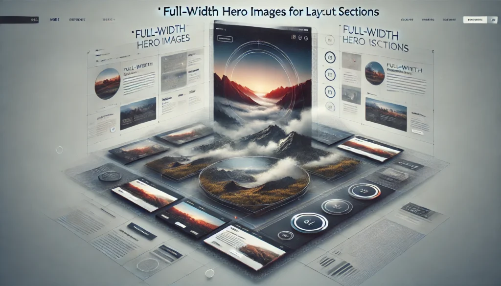
Creating impactful hero sections often requires scaling background images to cover entire viewport areas while maintaining visual quality across different devices.
Enlarging Product Images or Thumbnails on Hover/Click
E-commerce sites frequently use scaling effects to show product details. This might involve creating thumbnail galleries with expandable images or implementing gallery lightbox functionality.
When working with header images or header tags containing visual elements, proper scaling ensures consistency across different page layouts and responsive breakpoints.
Additional Considerations
Modern responsive design requires understanding how images behave within different contexts, from simple header img elements to complex gallery systems. The intrinsic aspect ratio and natural aspect ratio of images play crucial roles in how they scale and display.
For developers working with specific environments like terminal emulators or Ubuntu servers, image handling might require different approaches, but the core CSS principles remain consistent.
When implementing image scaling solutions, consider the broader context of your project, whether you’re working with CMS systems, product discovery interfaces, or landscape pages that require specific visual treatments.
Conclusion
Successfully increasing image size in CSS requires understanding the balance between visual impact and technical performance. By combining proper CSS techniques with thoughtful image preparation, developers can create engaging visual experiences that work across all devices and screen sizes.